User Interface Design
Juice Brand
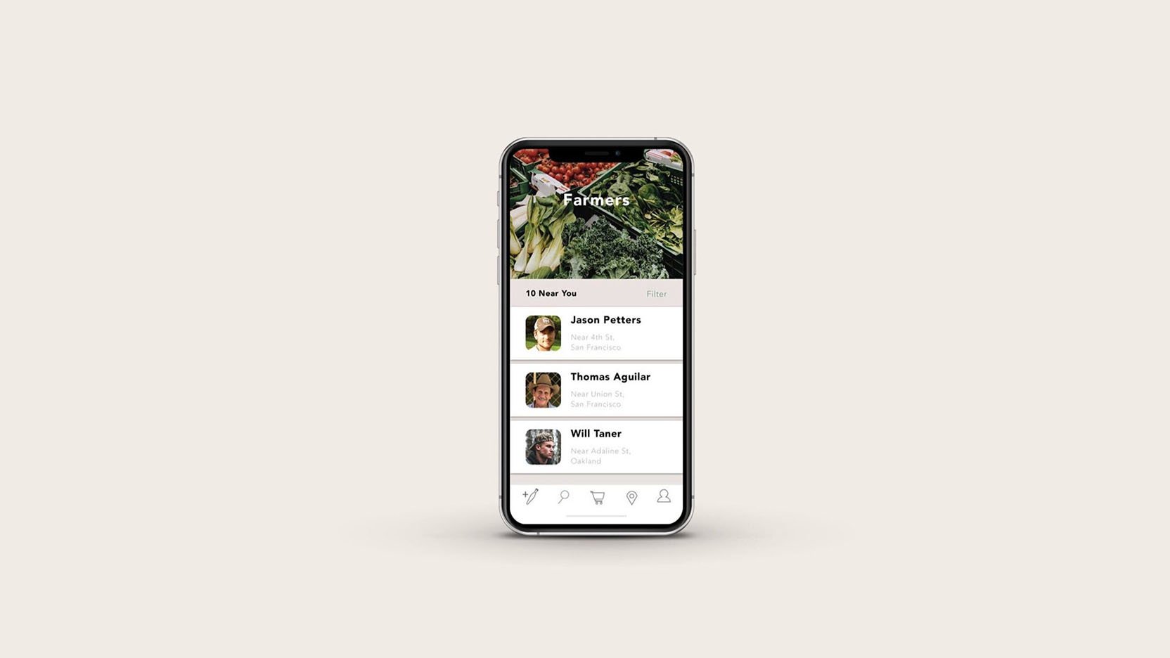
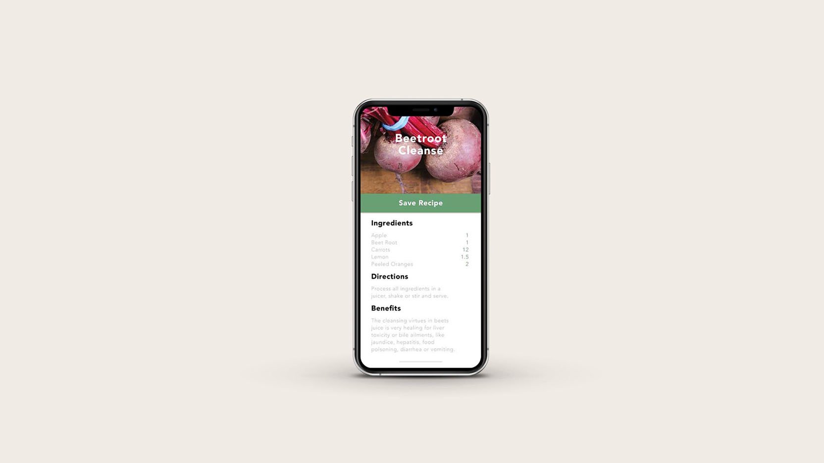
The design process begins with a deep understanding of the target audience. A juice company typically attracts health-conscious individuals, ranging from busy professionals to fitness enthusiasts and eco-conscious consumers. These users appreciate convenience, vibrant visuals, and intuitive navigation. Therefore, the interface should cater to this group by prioritizing features such as easy-to-find product information, simple ordering systems, and health-related content.
Visual Aesthetics: Clean, Fresh, and Organic
Since the brand revolves around fresh juices, the visual design of the app should reflect the essence of freshness. Using bright, natural colors like green, yellow, and orange, which evoke fruits and vegetables, will create an immediate association with healthy living. Additionally, integrating high-quality images of juices, fruits, and vegetables can add a sense of vitality and reinforce the brand’s promise of fresh, natural ingredients.
Minimalism plays a key role in the overall visual aesthetic. A cluttered interface can be overwhelming, especially for mobile users. Clean layouts with plenty of white space will allow content to breathe and keep users focused on what’s important—ordering their favorite juice or learning about the health benefits of different ingredients.


